Shopping Cart Tool
How to guide Intel buyers to use a new platform depending on what they need to buy?


Understanding the challenge
Intel company bought a new system to handle their office supplies purchases. The transition to this new platform needed to be progressive, specific users depending on what they purchased were required to complete orders in the new system. But, they resisted to move and continued using the old platform.
How can we guide buyers to use the new platform ?
Research. Understand. Experience
Followed process
Tools used: Axure RP and Adobe Illustrator
Research
Identifying rebel users
The old platform had already a warning for users indicating that specific products were available in the new system. So, In collaboration with tool product owner, we generated a report with the last month orders that contained materials that could be shopped in the new platform and this way we were able to identify the users that resisted during their shopping to move to the new tool.
Emphatize
+50
Interviews applied
Interviews were applied to users to identify the reason why they did not use the new platform, and why did they ignore the current warning the old application was showing.
80%
Did not read the warning at all. Some of these didn't realize the warning was there
20%
Did not want to use the new tool because they did not know how, and assumed was more complicated.
Define
Customer Journey
Now that we heard about our users we documented the customer journey they were following to identify opportunities based on their emotions at specific phases of entire purchase process.
-
Multiple opportunities were defined that could improve transition to the new system, not only through UI but as well throug motivating users before purchase for example: implementing campaigns, progressives trainings, contests...
-
Also, the moment and way the current warning was appearing in the tool was not the most strategic one to catch users attention, reason why some of them were ignoring the information.


Ideate
Current pop up analysis
There is an inviting question to to new system but, no link provided to access it
Information is showed like a list, no interactions
There is a coming soon message in the same hierarchy as tool information (not catchy)

Mentions tool name but, not how to access it (no link)
Prize motivation but, users not even read until this part of the text
Multiple options for user in the same format.
Position of buttons is not the most strategic one.
No correct hierarchy
UI proposal designed in Axure RP

-
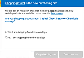
Flexibility: Including link for the new tool wherever it is mentioned
-
Tone and voice: Being enthusiastic, instead of having a bullet lists, we are talking to user through a question
-
Hierarchy: Moved Learn more link as part of the text where it belongs
-
Efficiency: Keeping just 2 buttons, these will be active depending on the option chosen by user
-
Aesthetic and minimalism: Image was removed to provide more balance to the UI and focus on the clearness of the text.
-
Visibility: Giving emphasys to available products in the new platform with color and bold font
-
Mapping: Providing options as answers to the question, this way depeding on users answer would be redirected to new system
Other UX Improvements
Timing
The old warning was appearing when users searched for products, causing an interruption of their experience and tending to close and ignore the message.
The new popup is appearing at the start of the purchase.
Creating confidence
Buyers did not feel confident to start using the new tool and assumed the experience would be worst. So we decided to:
-
Create a progressive training of the new tool showing them why it was better
-
Offer prizes as part of the training participation and contests
Campaigns
Some of the users were not aware of the new tool and its transition reason why we prepared an Email campaign for 3 months talking about attractive features in the new platform
Experience
Testing and implementation
Initially email campaings and progressive trainings were implemented (2 months), this way buyers became familiar to the transition and the new tool. After this, usability testing was done with 50 buyers and they were more receptive with the popup and feel comfortable being redirected to the new platform. With these results and having positive reaction about trainings and campaigns development team deployed popup in production.
90%
Of the orders that met the criteria were completed in the new tool after 3 months of the popup released.
Conclusion
This project reminds me the importance of not only focus on UI design solution, UX cannot be forgot as part of the entire process and day to day situations our users have. Defining actual customer journeys by listening our users helped us empathizing and so, to decide the most correct approach to follow on our proposal. Finally, beyond the redesign of the pop-up, enabling trainings, contests and campaigns were the key fact to solve this challenge, with those we achived buyers to have confidence and become familiar with the new platform and so, to be more receptive with our pop up.
Thanks for watching!
